
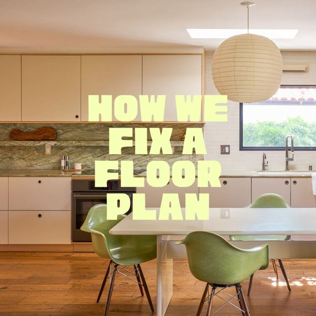
How We Fix a Floor Plan: The Brunswick Kitchen Redesign in Atwater Village
How We Fix a Floor Plan: The Brunswick Kitchen Redesign in Atwater Village
June 3, 2026
A bad floor plan will defeat beautiful materials every time.
I know this because Brunswick came to us with some of the most beautiful materials I’ve seen walk through a project: dramatic swirling green quartzite slabs, creamy matte subway tile, Bosch appliances ~ all purchased, all sitting in a warehouse, all waiting to be installed in a layout that had no business housing any of them.
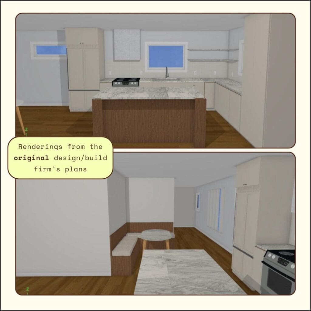
The clients had inherited a floor plan from a design/build firm that had spent months on their 1940s Atwater Village bungalow and delivered very little. What they had delivered was a kitchen layout that wasted its footprint, an entry that didn’t function as an entry, and a common area that hadn’t been thought through as a place a family actually lives. The stone was gorgeous. The plan was not.
Before we talked about a single finish, we talked about the floor plan.
What Was Wrong With the Original Layout
The original plan had a few fundamental problems that no amount of good material was going to solve.
- The kitchen ran short. The work surface was undersized for the space and for how the family actually cooks ~ not enough countertop, not enough storage, appliances arranged in a sequence that didn’t support a natural workflow.
- There was no entry. The front door opened directly into the living space with nothing to mark the transition ~ no moment of arrival, no visual pause between outside and inside. In a bungalow this size, that makes the whole common area feel smaller than it is.
- The dining table had no real home. It was placed where it fit rather than where it belonged, which meant it competed with the kitchen instead of anchoring the open plan.
- And the windows ~ their placement in the original scheme meant the light wasn’t working for the space. A kitchen that faces a garden in Los Angeles should feel connected to that garden. This one didn’t.
Kitchen and entry layout redesign is something we approach systematically: what does the space need to do, who is using it and how, and what is the minimum number of moves that gets us there. At Brunswick, the answer was surprisingly contained. We didn’t touch the exterior walls. We didn’t add square footage. We made seven considered moves and the kitchen effectively grew.
How We Reworked the Floor Plan
We created an implied entry. A new partition wall with circular porthole cutouts defines the arrival sequence without closing off the open plan. It gives the front door its own moment ~ a visual pause that separates entry from living ~ and it makes the entire common area read larger by giving each zone its own identity.
We extended the work surface. The countertop run is now significantly longer than the original plan, with more cabinetry above and below. The kitchen can actually function as a kitchen: room to prep, room to cook, room to put things down.
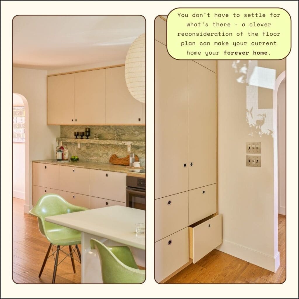
We redesigned the cabinetry sequence. Floor-to-ceiling cabinetry on one wall, open plywood shelving at the peninsula, a stone backsplash shelf running the length of the cooking wall. Each element is doing specific work ~ storage, display, material expression ~ without any of it feeling like it was added on.
We centralized the dining table. The table is now the true anchor of the open plan, positioned so the kitchen, living room, and entry all orient toward it. When you walk in the front door, the table is what you see. That’s intentional. It tells you what this house is for.
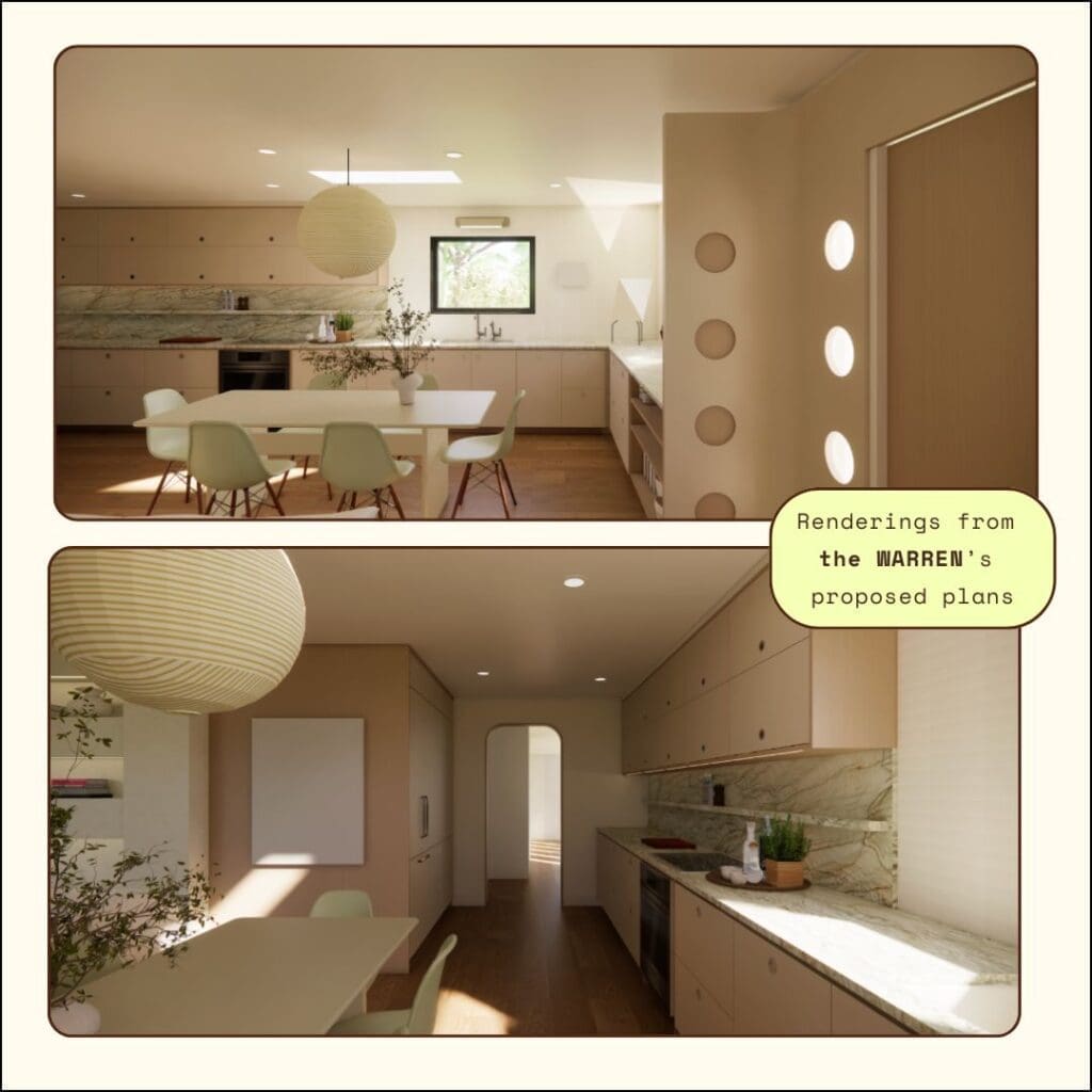
We rearranged the appliances. Cooktop, oven, sink, and refrigerator are now in a sequence that supports how people actually cook ~ a proper work triangle, with the refrigerator positioned at the entry to the kitchen so you’re not walking through the work zone to reach it.
We repositioned a window to improve both the light quality and the view from the primary work position at the sink. Standing at the sink, you now look out into the garden. That detail costs nothing structurally and changes the feeling of being in that kitchen entirely.
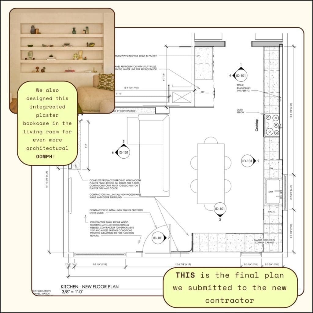
We designed an integrated plaster bookcase in the living room. This wasn’t a kitchen move, but it was part of the same floor plan logic ~ giving the living room an architectural anchor that matches the weight and intention of the millwork in the adjacent space. The fireplace gets wrapped in the same claylike plaster, and the two elements together make the living room feel designed from the inside out rather than furnished after the fact.
The Result: A Bigger Kitchen in the Same Four Walls
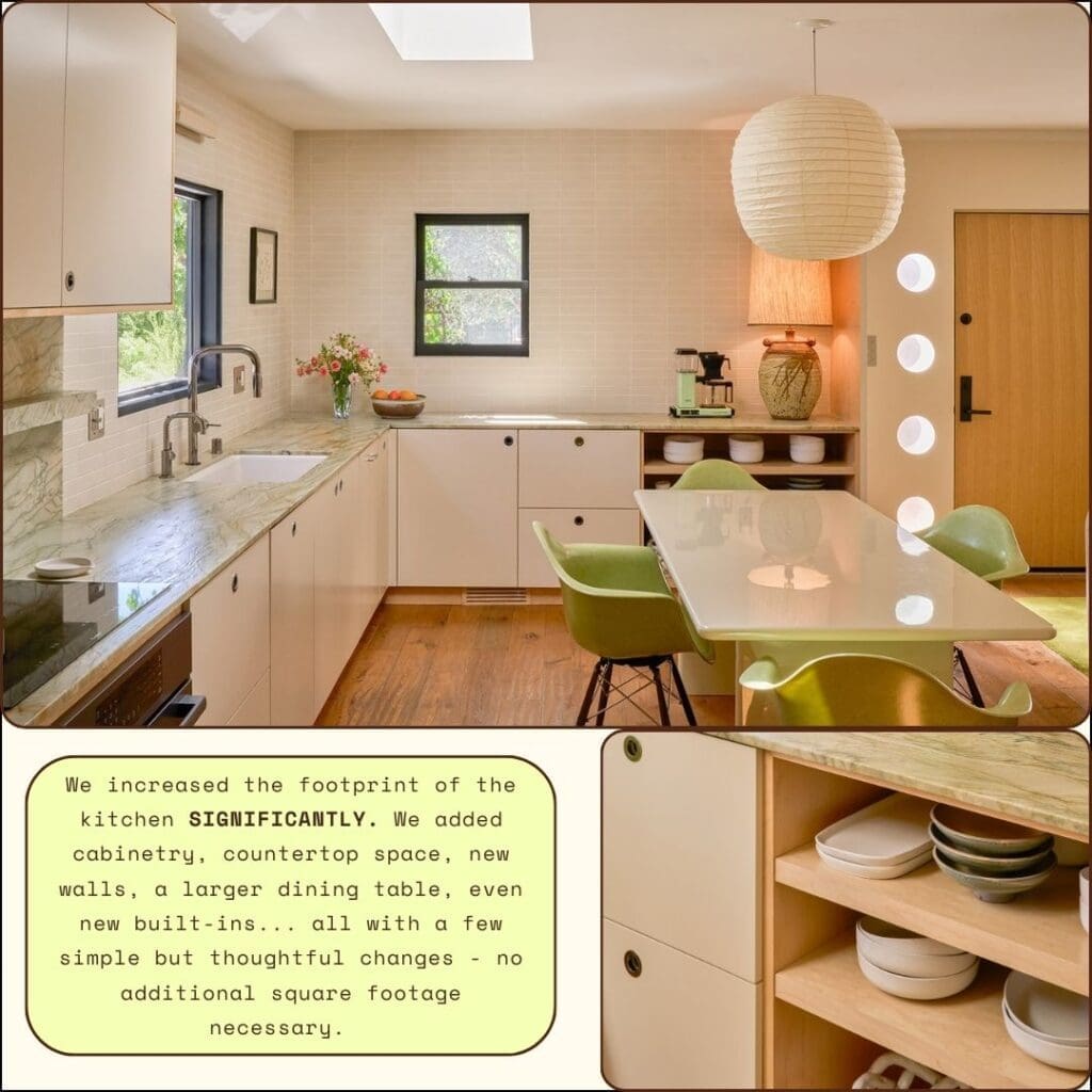
When the build was complete, the kitchen had grown ~ significantly ~ without a single square foot of addition. More counter space, more storage, better light, a functional entry, a dining table that finally had a reason to be where it was.
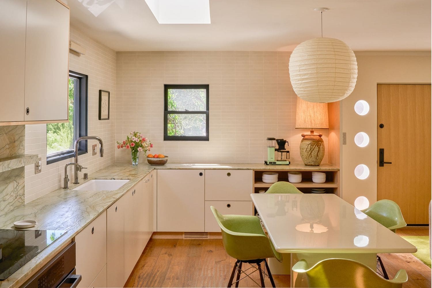
The materials the clients had been holding onto finally had a floor plan worthy of them. The green quartzite runs as both countertop and full-height backsplash, a continuous slab that brings organic warmth into the streamlined modern base. The cabinetry ~ maple plywood combined with matte cream paint ~ is warm and textural and intentionally quiet so the stone reads as the statement. The round chrome finger-pull hardware echoes the porthole shape of the entry partition, so the architectural detail carries through every surface. Pistachio Eames chairs, a lacquered dining table, an Akari pendant overhead.
It works because the floor underneath it was set up to let it work.
What This Looks Like as a Process
If you’re looking at a kitchen renovation in Los Angeles ~ or anywhere ~ and something feels off about the layout, here is the sequence we use to evaluate it:
First, map how the space is actually used. Not how it was designed to be used, but how the family moves through it on a Tuesday morning. Where does everyone end up? Where are the collisions? Where does the workflow break down?
Second, identify the fixed constraints. Exterior walls, load-bearing elements, plumbing stacks, electrical panels ~ these are real. Everything else is a decision, not a given.
Third, make the minimum number of moves. The temptation in a floor plan redesign is to keep going once you start. The discipline is knowing when the plan is solved and stopping there. Every additional move adds cost, time, and complexity. Brunswick needed seven moves. Some projects need three.
Fourth, let the architecture and the millwork speak to each other. The porthole partition at Brunswick was a spatial move and a design move at the same time ~ it solved the entry problem and established a motif that the hardware and the built-ins carried through the rest of the space. A good floor plan redesign doesn’t just fix the layout. It gives the design something to say.
The Floor Plan Is Always the First Conversation
We get asked often when the right time is to bring in an interior designer for a kitchen renovation or a home remodel. The answer is always the same: before the floor plan is finalized. Ideally before permits are pulled. Definitely before demo begins.
A floor plan is the hardest thing to fix after the fact. It’s also the thing that determines whether every subsequent decision ~ the countertops, the cabinetry, the light fixtures, the furniture ~ lands the way it should or fights the space it’s in.
Brunswick is the clearest illustration of that argument I can point to. The materials were already there. The budget was already committed. What the project needed was someone to look at the layout and ask the right questions before anything got built. See the full project here
If you’re at that stage ~ planning a kitchen renovation, reconsidering a floor plan, or trying to figure out why a space that should work doesn’t ~ we’d love to talk.
The Warren is a full service interior design studio based in Los Angeles, serving clients across Southern California and beyond. Book a complimentary discovery call →
Christian Warren is the founder and principal designer of The Warren, a full service interior design studio based in Los Angeles. She has led projects across Southern California and beyond, with a practice built on architecture-level thinking, rigorous space planning, and interiors that feel genuinely personal.
Christian Warren
A bad floor plan will defeat beautiful materials every time.
I know this because Brunswick came to us with some of the most beautiful materials I’ve seen walk through a project: dramatic swirling green quartzite slabs, creamy matte subway tile, Bosch appliances ~ all purchased, all sitting in a warehouse, all waiting to be installed in a layout that had no business housing any of them.
The clients had inherited a floor plan from a design/build firm that had spent months on their 1940s Atwater Village bungalow and delivered very little. What they had delivered was a kitchen layout that wasted its footprint, an entry that didn’t function as an entry, and a common area that hadn’t been thought through as a place a family actually lives. The stone was gorgeous. The plan was not.
Before we talked about a single finish, we talked about the floor plan.
What Was Wrong With the Original Layout
The original plan had a few fundamental problems that no amount of good material was going to solve.
- The kitchen ran short. The work surface was undersized for the space and for how the family actually cooks ~ not enough countertop, not enough storage, appliances arranged in a sequence that didn’t support a natural workflow.
- There was no entry. The front door opened directly into the living space with nothing to mark the transition ~ no moment of arrival, no visual pause between outside and inside. In a bungalow this size, that makes the whole common area feel smaller than it is.
- The dining table had no real home. It was placed where it fit rather than where it belonged, which meant it competed with the kitchen instead of anchoring the open plan.
- And the windows ~ their placement in the original scheme meant the light wasn’t working for the space. A kitchen that faces a garden in Los Angeles should feel connected to that garden. This one didn’t.
Kitchen and entry layout redesign is something we approach systematically: what does the space need to do, who is using it and how, and what is the minimum number of moves that gets us there. At Brunswick, the answer was surprisingly contained. We didn’t touch the exterior walls. We didn’t add square footage. We made seven considered moves and the kitchen effectively grew.
How We Reworked the Floor Plan
We created an implied entry. A new partition wall with circular porthole cutouts defines the arrival sequence without closing off the open plan. It gives the front door its own moment ~ a visual pause that separates entry from living ~ and it makes the entire common area read larger by giving each zone its own identity.
We extended the work surface. The countertop run is now significantly longer than the original plan, with more cabinetry above and below. The kitchen can actually function as a kitchen: room to prep, room to cook, room to put things down.
We redesigned the cabinetry sequence. Floor-to-ceiling cabinetry on one wall, open plywood shelving at the peninsula, a stone backsplash shelf running the length of the cooking wall. Each element is doing specific work ~ storage, display, material expression ~ without any of it feeling like it was added on.
We centralized the dining table. The table is now the true anchor of the open plan, positioned so the kitchen, living room, and entry all orient toward it. When you walk in the front door, the table is what you see. That’s intentional. It tells you what this house is for.
We rearranged the appliances. Cooktop, oven, sink, and refrigerator are now in a sequence that supports how people actually cook ~ a proper work triangle, with the refrigerator positioned at the entry to the kitchen so you’re not walking through the work zone to reach it.
We repositioned a window to improve both the light quality and the view from the primary work position at the sink. Standing at the sink, you now look out into the garden. That detail costs nothing structurally and changes the feeling of being in that kitchen entirely.
We designed an integrated plaster bookcase in the living room. This wasn’t a kitchen move, but it was part of the same floor plan logic ~ giving the living room an architectural anchor that matches the weight and intention of the millwork in the adjacent space. The fireplace gets wrapped in the same claylike plaster, and the two elements together make the living room feel designed from the inside out rather than furnished after the fact.
The Result: A Bigger Kitchen in the Same Four Walls
When the build was complete, the kitchen had grown ~ significantly ~ without a single square foot of addition. More counter space, more storage, better light, a functional entry, a dining table that finally had a reason to be where it was.
The materials the clients had been holding onto finally had a floor plan worthy of them. The green quartzite runs as both countertop and full-height backsplash, a continuous slab that brings organic warmth into the streamlined modern base. The cabinetry ~ maple plywood combined with matte cream paint ~ is warm and textural and intentionally quiet so the stone reads as the statement. The round chrome finger-pull hardware echoes the porthole shape of the entry partition, so the architectural detail carries through every surface. Pistachio Eames chairs, a lacquered dining table, an Akari pendant overhead.
It works because the floor underneath it was set up to let it work.
What This Looks Like as a Process
If you’re looking at a kitchen renovation in Los Angeles ~ or anywhere ~ and something feels off about the layout, here is the sequence we use to evaluate it:
First, map how the space is actually used. Not how it was designed to be used, but how the family moves through it on a Tuesday morning. Where does everyone end up? Where are the collisions? Where does the workflow break down?
Second, identify the fixed constraints. Exterior walls, load-bearing elements, plumbing stacks, electrical panels ~ these are real. Everything else is a decision, not a given.
Third, make the minimum number of moves. The temptation in a floor plan redesign is to keep going once you start. The discipline is knowing when the plan is solved and stopping there. Every additional move adds cost, time, and complexity. Brunswick needed seven moves. Some projects need three.
Fourth, let the architecture and the millwork speak to each other. The porthole partition at Brunswick was a spatial move and a design move at the same time ~ it solved the entry problem and established a motif that the hardware and the built-ins carried through the rest of the space. A good floor plan redesign doesn’t just fix the layout. It gives the design something to say.
The Floor Plan Is Always the First Conversation
We get asked often when the right time is to bring in an interior designer for a kitchen renovation or a home remodel. The answer is always the same: before the floor plan is finalized. Ideally before permits are pulled. Definitely before demo begins.
A floor plan is the hardest thing to fix after the fact. It’s also the thing that determines whether every subsequent decision ~ the countertops, the cabinetry, the light fixtures, the furniture ~ lands the way it should or fights the space it’s in.
Brunswick is the clearest illustration of that argument I can point to. The materials were already there. The budget was already committed. What the project needed was someone to look at the layout and ask the right questions before anything got built. See the full project here
If you’re at that stage ~ planning a kitchen renovation, reconsidering a floor plan, or trying to figure out why a space that should work doesn’t ~ we’d love to talk.
The Warren is a full service interior design studio based in Los Angeles, serving clients across Southern California and beyond. Book a complimentary discovery call →
Christian Warren is the founder and principal designer of The Warren, a full service interior design studio based in Los Angeles. She has led projects across Southern California and beyond, with a practice built on architecture-level thinking, rigorous space planning, and interiors that feel genuinely personal.
June 3, 2026
Christian Warren


